Monday, April 15, 2013
Stem-and-leaf Plot
http://www.uow.edu.au/student/attributes/statlit/modules/module2/centre.html
Stem-and-leaf plots are used to show frequency data. In other words, it represents the distribution of the data. The "stem" is the numbers on the left side of the verticle line and the leafs are on the right. The key at the top lets you know that the stems are actually in tens. This means that the "5" is actually "50". The values in the leaf section only represent one value and they follow the stem number. So for instance, if you look at the "5" stem it means the numbers within "50" are 51, 51, 52, 52, 54, 55, and 57. This is an easy way to represent data in a graphic form that is quick to read and does not sacrifice any of the information.
Box Plot
http://staffweb.mps.k12.mi.us/MurphyLL/Resources.html
Box plots are used to represent data at its five number summaries which consist of sample minimum, lower quartile, median, upper quartile, and sample maximum. This box plot diagram shows the annual snow depths at mathsville ski resort. The line all the way to left shows that the sample minimum is approximately 30, the lower quartile approximately 50, the median approximately 75, upper quartile approximately 105, and the sample maximum approximately 125.
Histogram
http://gnuplot.sourceforge.net/demo_4.3/histograms.html
Histograms are used to show the distributions of data and their frequencies. Their main focus is to show statistical variances of the different variables. This histogram for instance is showing the immigration amounts from Northern Europe into Denmark, Netherlands, Norway, and Sweden during the different years. The years being represented can be found in the top right portion of the graph and are color coordinated with the immigration amounts and country of origin. As one can see, Sweden has by far received the highest amounts of immigrants over the decades.
Parallel Coordinate Graph
http://www.evl.uic.edu/aej/424/kyoung/Training-parallelcoordinate.html
Parallel coordinate graphs are used to view multiple variables at a single time. For these types of graphs, each data set must be placed into the verticle axis's and is then corresponded to each axis through a line that connects them. This type of process is done to show any types of relationships between the different variables. This map is comparing different fish lengths in different areas. As you can see, L1, L2, and L3 show no real difference which means that they are highly correlated. However there are major differences between L21, L32, and L31 and their correlations to each other and different heights and widths.
Triangular Plot
http://www.ex-parrot.com/~chris/wwwitter/20050407-it_doesnt_matter_how_you_vote_either_way_your_planet_is_doomed.html
Triangular plots are used to represent three different data sets at the same time. For this map in particular, it is representing three different major political parties, the Liberal Democrat vote, Conservative vote, Labour vote, and their percentage to win over majority of the parliament in the UK. The white circle in the middle is to represent the current estimate from the opinion polls.
Windrose
http://nj.usgs.gov/grapher/tutorial/examples.html#windrose
Windrose graphs are used to display wind direction and speed for a specific location for a particular time frame. This graph is showing the wind data for Klamath Falls, Oregon from January 1st, 2006 through December 31, 2010. The windrose can tell you which direction winds traveled and the frequency at which they blew. They also can show you the wind speed and how long those winds occured. As you can see most winds flow North, Northwest and had a peak intensity of 18.64%.
Climograph
http://en.wikipedia.org/wiki/File:CalcuttaMetric.png
Climographs are representations of temperature and precipation observations based upon different times of the year in different areas of the world. They are typically done month by month and used for quick, standardized reports of the climate for specific regions. The red line that is shown near the top of the graph is used to represent the temperature of those months and the green bars are for the precipitation. These maps are great at showing when the hottest and most frequent precipiation amounts are within the year. In addition this map is showing these values for Savannah, Georgia so one can observe that July and August are the hottest months and May receives the heaviest amounts of rainfall and precipitation.
Population Profile
http://www.census.gov/2010census/
This is an example of a population profile because it shows the population distributions of sex and age between male and female in the District of Columbia. The women are color coded with pink and the men with blue. The bottom of the graph is how many individuals there are for the age classes on the right.This image comes from the 2010 Census and you can notice that the main points lie at 30 years old for both men and women.
Scatterplot
http://blogs.mygns.ca/groups/math8v/weblog/d22e6/
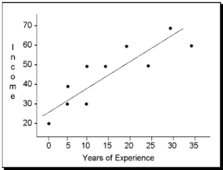
Scatterplots are used to plot either one individual or multiple indivuals observations into a diagram so that a trend may be determined between the subjects. For instance, this graph is comparing how years of experience relate to income. The solid line in the middle is the trend line which shows either a negative or positive correlation between these two subjects; for this map there is a possitive correlation.
Lorenz Curve
http://anneclaireramser.wordpress.com/page/2/
The Lorenze Curve, like shown above, is used to present the inequality of distribution of some factor such as income. For this image, and any Lorenze Curve for that matter, the solid black line is used to represent what perfect equality would be whereas the curved line underneath, the Lorenze Curve, is showing what the actual distribution is like. From this map you can tell how unequal the relationship between percentage of populatoin and percentage of national income really is.
Bilateral Graph
http://www.mathworks.com/help/finance/hist.html
Bilateral graphs are used to represent more than one set of data points at a time. These maps are very similar to those of bargraphs or histograms. These maps are used to compare the different sets of data; and in this case they compare different prices at disney on a side-by-side column format.
Nominal Area Choropleth Maps
http://www.veiled-chameleon.com/weblog/archives/2004_07.html
Nominal area choropleth maps are used to represent nominal data on a map so that it may be understood easier. For instance, this map represents the different swing states during the 2004 Presidential Election. This deals with nominal data because each state gets a color that is based off of its political majority of people.
Unstandardized Choropleth Map
http://www.censusscope.org/us/map_common_race.html
This is an example of an unstandardized choropleth map. These types of choropleth maps take the data sets that are being represented and leave them in the original value instead of averaging them out; or standardizing them. For instance, this map is representing the races that have populations larger than the national average of that county. Therefore, it is not standardizing the races but showing the most dominant races by county.
Sunday, April 14, 2013
Standardized Choropleth Map
http://www.cdc.gov/pcd/issues/2007/oct/07_0091.htm
This is an example of a standardized choropleth map because the data information is standardized so that it may be easier to use for comparison. For instance, this map standardized the percentage of individuals in the U.S. so that it may be easier to read.
Univariate Choropleth Map
http://www.colocarto.com/custom-thematic-maps.html
This is an example of an univariate choropleth map because it only represents the data for one variable of information. The data comes from the estimated median household income of 2008 and uses a color scheme for the representation.
Bivariate Choropleth Map
http://www.cartogrammar.com/blog/indiemapper-is-here/
This is an example of a bivariate choropleth map because it represents two different data amount simultaneously. This map is representing different age populations in the US back in 1900. If you are looking at the key you will see that the top axis is ages 5-17 and the right axis is 50-64. It then can use different color schemes that will represent the data points that were being used.
Unclassed Choropleth Map
http://www.agocg.ac.uk/reports/visual/casestud/dykes/issue3_1.htm
This is an example of an unclassified choropleth map. This map is much like a classed choropleth map except it uses a continuous gray scale and the cartographers do not have to classify the data being represented.
Classed Choropleth Maps
http://personal.uncc.edu/lagaro/cwg/color/color_symbol.html
This is an example of a classed choropleth map because it takes the information, which in this case expenditures for public education per pupil, and plaes them into "classes" that are color oriented. Each county in North Carolina is represented by one of the five classes located in the key in the bottom left. This map does a great show representing the values because the color gradient of yellow to green really makes the lowest and highest regions stand out.
Range Graded Proportional Circle Map
https://www.e-education.psu.edu/geog486/book/export/html/1796
This is an example of a range graded proportional circle map. These types of proportional circle maps use different size circles to represent the data amounts for multiple areas. For instance, this map uses larger circles to show more motor vehicle deaths in the different counties of California and smaller circles to show lower counts.
Continuously Variable Proportional Circle Map
https://www.e-education.psu.edu/geog486/book/export/html/1796
This is an example of a continuously variable proportional circle map because the circles represent multiple variables, as opposed to the typical proportional circles map. For this image, the size of the circles represent the amounts of meat that these particular areas of France shipped off to the butchers in Paris. In addition for this map, the circles are also represented in pie chart form that show the types of meat and how much was shipped off.
Friday, April 12, 2013
DOQQ
http://www.crwr.utexas.edu/gis/gishydro00/Class/trmproj/Donnelly/termproject.htm
DOQQ stands for Digital Ortho Quarter Quads. They are a digital image of an aerial photo but also help to improve the terrain of the land being photographed. This is an example of a DOQQ map of Texas that shows a 500-year floodplain. These maps can be color schemed such as the Red above, or Black and White.
DEM
http://www.humboldt.edu/geology/courses/geology350/350_maps_airphotos.html
This is an example of Digital Elevation Model. These types of maps can be used for many different types of analysis such as precipitation patterns or wind patterns but they represent one key feature which is elevation. This map here shows the elevation of the Lomerias Muertas in Chittenden, California. One can notice though the in the top left portion of the image we can see white caps which means these are the highest points of the range.
DLG Map
http://barthelmy.com/consulting/projects/proj_custom_data_MidContinent.htm
A DLG map is a cartographic map from the USGS that is represented in digital form. This map for instance represents different data lined out such as county boundaries, but it can also include hydrographic features, roads, National Park boundaries, and etc.
DRG
http://www.tceq.texas.gov/gis/drg.html
A DRG map, also known as a Digital Raster Graphic, is a scanned image of a USGS topographic map into a computer. These maps can include spatial data, geographical features, and any other aspect of a map. This map here is a scanned image from a topographic map that represents the Colorado River and surrounding features such as schools.
Isopleth Map
http://dwb4.unl.edu/Chem/CHEM869V/CHEM869VLinks/weather.about.com/newsissues/weather/library/weekly/aa071600a.htm
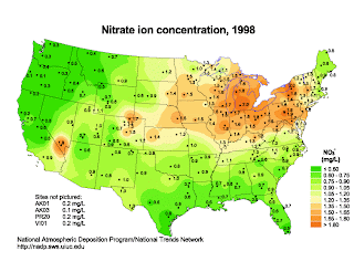
This is an example of an isopleth map that uses the third dimension of color to indicate the Nitrate ion concentration of the US in 1998. Isopleth maps are used to simplify data that is continuously distributed across a region. In this case, after looking at the key located at the bottom right, one can observe that the most highly concentrated areas were located in the North eastern states and with the highest being at a 2.0 mg/L in Michigan.
Sunday, April 7, 2013
Isopachs
http://www.geology.ohio-state.edu/~vonfrese/gs100/lect35/index.html
This is an example of an Isopach map of the United States. These maps are used to represent rock thickness in certain regions. Contour lines are used to show equal rock thickness'. This map here shows the Cambrian System in North America.
Isohyets
http://www.hpc.ncep.noaa.gov/tropical/rain/leslie2000.html
This is an example of a isohyet map of South Florida after the Subtropical Depression Leslie struck the region. These types of maps are designed to try and predict the amount of rainfall within certain areas or indicate how much as fallen already. The contour lines are used to show how much precipitation has fallen within those areas, and to make things even easier they are color coordinated with the key located in the top right portion of the map. This map shows the rainfall amounts in to 2 inch intervals and also shows the South Miami received 17.50" of rain.
Isotach
http://www.erh.noaa.gov/btv/events/28Oct2008/ua2.php
This is an example of an Isotach map of the United States. Each line represents equal wind speed and they also show the direction they are moving.
Isobar
http://mxp.blogs.cnn.com/category/weather/rain/
.
This is an example of an isobar map of the United States. Each line represents the barometric pressure across that gradient. In other words, the same barometric pressure is found everywhere along that specific line.
LIDAR
http://www.noaanews.noaa.gov/stories/s798.htm
This is an example of a LIDAR image from NOAA that shows piles of rubble and debris in New York back in 2001. The LIDAR is available from planes with special lasers on them that scan the areas and allow 3-D images to be produced. In this case, the images were produced so that construction workers knew what types of cranes would be appropriate for the clean-up procedures.
Doppler Radar
http://www.srh.noaa.gov/mlb/?n=frances
This is an example of a Doppler Radar map used by National Weather Service that shows Hurricane Frances over Florida. These types of maps show rainfall based on its color. The darker colors such as orange to purple represent more violent weather because those areas have higher clouds which means colder clouds which means more stored precipitation.
Black and White Aerial Photo Map
http://freegeographytools.com/2007/goofing-around-with-pan-sharpening
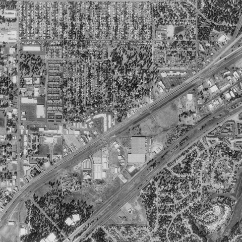
This is a black and white aerial photo of what appears to be a small town with a residential neighborhood, major roads, and companies. These types of photos are more traditional based because they do not have a wide color scheme, only those that range between black and white.
Subscribe to:
Comments (Atom)


.gif)


.gif)
.gif)

.jpg)


