Sunday, March 24, 2013
Infrared Aerial Photo
http://www.achromaticplus.co.uk/index.php?page=infrared-aerial
This is an example of an infrared aerial photo. It is using infrared imaging which measures wavelengths to determine aspects such as thermal radiation. This map is looking at Moffett Field, California and the different shades of red indicated different temperatures in those areas.
Cartographic Animation Map
http://uwacadweb.uwyo.edu/JSHINKER/animations/global/
This is an example of a cartographic animation. It shows the different wind velocity magnitudes at 500 mb in Height all over the world with a color key located in the bottom left. It is an animation because it is a "moving" image.
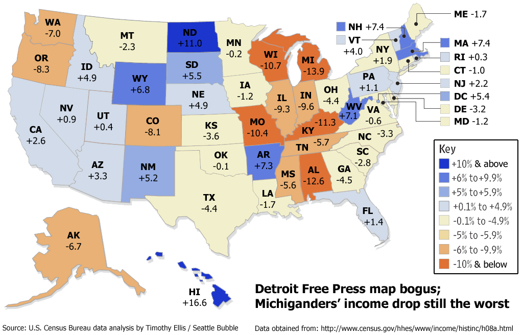
Statistical Map
This is an example of a stistitical map. These types of maps use statistics from numerical data to represent information. In this picture, the statistics are those of income drops within all 50 states; it also goes to show that Michigan had the lowest income drop.
Sunday, March 3, 2013
Cartogram
http://www-personal.umich.edu/~mejn/election/2012/
This is an example of a cartogram map that is redrawn to show the states based off of their populations instead of acreage. The significance for redrawing the map this way is that during the 2012 Presidential Election, if one was to be looking at a typical US map the Republican Party (Red) would appear to take up majority of the states making it appear that Romney won, when it actuality the Democratic Party (Blue) won because the states in blue contain much more population than those in red. For reasons like this, Cartogram maps are drawn to help show better representations of factors such as population.
This is an example of a cartogram map that is redrawn to show the states based off of their populations instead of acreage. The significance for redrawing the map this way is that during the 2012 Presidential Election, if one was to be looking at a typical US map the Republican Party (Red) would appear to take up majority of the states making it appear that Romney won, when it actuality the Democratic Party (Blue) won because the states in blue contain much more population than those in red. For reasons like this, Cartogram maps are drawn to help show better representations of factors such as population.
Flow Map
This is an example of a Flow Map because it uses lines to show movement of certain subjects. For instance, this image represents the annual freight tonnage by seperate modes like the National Highway System, U.S. Class I Railroad, and Inland Waterways. The thickness of the lines also helps readers to determine where the most flow takes place.
Isoline Maps
http://giscommons.org/?page_id=18
This is an example of an isoline map because it shows equal data over the continuous surface of different areas. For instance, the lines above, also known as contour lines, represent equal data along the line through the help of multiple measurements taken in the locations. This map is one that I believe shows equal elevation patterns of the United States.
Subscribe to:
Posts (Atom)


